If you own a construction company, it is crucial to have a website so that your prospects and potential customers know about your company. Your online presence is as significant as your physical presence. However, just having a website alone will not solve your purpose. You need a stunning website for your construction company that provides an engaging and efficient user experience. The best construction website designs impress your audience with stylish portfolios, presentations, and attractive imagery.
Whether you want to revamp your construction website or plan to build from scratch, here are the best construction website designs to get started. You can take inspiration from some of these websites and build a website that stands out from the competition.
1. What Makes a Good Construction Website?
- A well-designed services section
A good construction company website design should have a well-designed services section. Your target audience should be able to navigate across each service page seamlessly. Most people look for different search results separately, so Google displays your services pages separately. A good construction website with multiple service pages will likely drive more traffic.
- Project Portfolio
A good construction website should feature a project portfolio section related to your services. The website should support when you add multiple projects and upload photos about each of your projects. The visitors should not struggle to sort through your projects or find information on projects they are interested in.
- Call-to-action (CTA)
CTAs are essential in directing your audience to take a specific action. You can reduce the bounce rate, which often happens because of confusion or lack of understanding. A good construction website will have a diverse range of CTAs like – “Request a Callback”, “View Project”, “Contact Us”, “Know More”, and “Learn More”.
2. 10 Best Construction Website Designs to Explore
2.1 Acecon
Acecon General Contracting is a construction firm based in Canada, specialising in institutional and commercial projects. The homepage grabs attention by showcasing an incredible portfolio of projects. With a great menu, fantastic background images and lots of white spaces, the website attracts visitors and aids in boosting the company’s online exposure.
The colours are bright and saturated and help increase readability. The website’s key layout is distinguishable, and a striking call to action above the fold ensures conversion. The level of information on the website is highly impressive. It takes a pleasant experience to visualise the construction experience as you scroll down the page.
2.2 Advocate Construction
Advocate Construction is a professional construction company based in Colorado, USA, specialising in residential and commercial roofing services. When you land on the website, you will first notice the vibrant colour scheme with high-quality HD images over a navy blue background that adds a lot to the appearance.
With ample negative space in the background, the website showcases various design elements on every page so visitors can browse the site effortlessly. With so much information, nothing seems cluttered on top of each other. Besides, there are multiple CTAs like – free inspection and benefits that lure the customers to try their services.
2.3 Castle Custom Homes

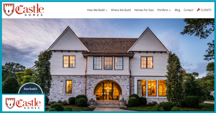
Castle Custom Homes is a design-build located in Nashville that strives to build the custom homes of your dreams. The website has balanced typography that puts content into the spotlight. The clean and minimal designs guide the users through the company profile and how they work.
The clean design creates a lasting impression and delivers a captivating experience for the visitors. The landing page and images throughout the website are beautiful, and each picture tells a compelling story. The introduction blends seamlessly into the site and offers easy navigation through the rest of the sections, including – Portfolio, Green Homes, How We Build, and Homes for Sale.
2.4 Desert Star Construction
Desert Star Construction, located in Arizona, is a full-service construction company specialising in building luxury homes. With a straightforward menu, sliding header, and videos – the website has everything you need to take the next step in the customer journey. This is one of the cleanest construction website designs we’ve seen. With minimalistic and pleasant elements, the website has a smooth feel with a good page load speed.
The website is designed with a strong consideration of each element, including – the colour scheme, menus, typography, footer, and popups. Its responsive design fits all devices’ skin and organises the elements with a powerful drag-and-drop builder. Every image on the website shows their creativity and engages the visitors.
2.5 Epstein
Epstein is a multi-disciplinary construction company in the United States, specialising in design and construction. Their homepage features a nice slider that displays previous projects. Also, the menu is clean, making the website smooth and pleasant to navigate.
The website is fabulous to look at and has some fun animations that make the the website a fun appeal. Overall, the website has a great design with high-quality images and attractive typography. Maintaining usability, they created a seamless navigation experience to explore the rest of the site’s content. The structure is perfect for building construction and architecture websites.
2.6 Fineline Carpentry & Building
Fineline Carpentry and Building in the United Kingdom specialises in commercial and residential construction. The website is truly inspiring, with a slick design, engaging background, informative pages, and cool images that increase the level of interest in the site. In addition, they created a unique menu page with lots of page transitions and well-thought-out artistic photos.
There aren’t a lot of menu options to navigate across the website. However, the About Us, Services, and Projects menu provides enough information for the visitors to know about their offerings. We appreciate the reviews menu on their site, which is noteworthy for a construction website. Adding further to it is the latest news, which you should explore before availing of carpentry services.
2.7 Mosaik Design & Remodeling

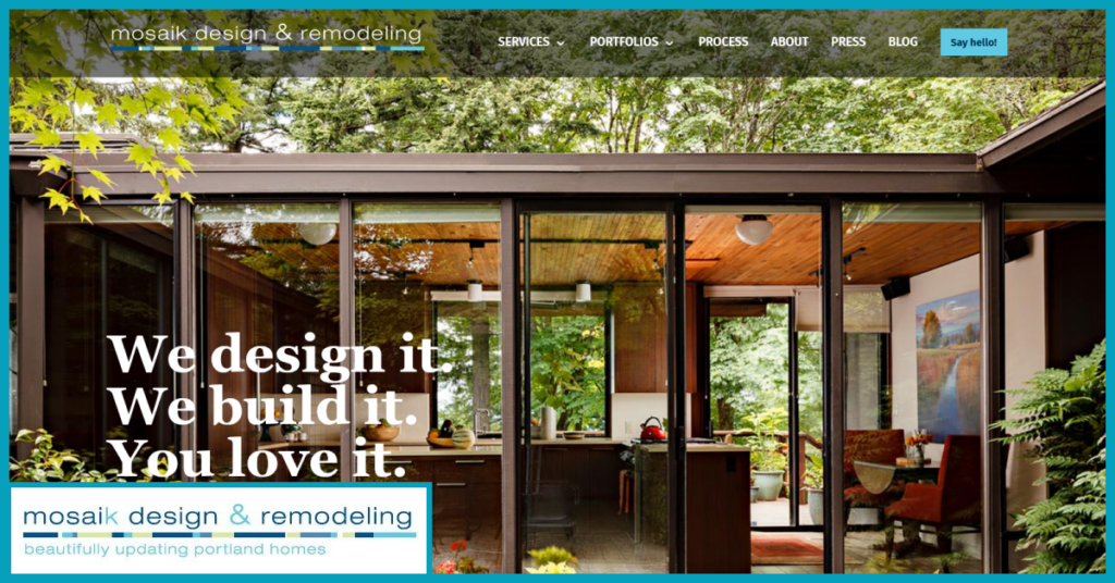
Mosaik Design & Remodeling is a full-service residential remodelling company in the USA, specialising in beautifying living spaces. This construction company’s website design is modern and sophisticated with stunning photographs and attractive typography. In addition to HD-quality photos, each section is aesthetically appealing and helps communicate the brand image and differentiate it from its competitors.
Mosaik’s website features a project gallery with a robust portfolio in kitchen, bathroom and interior design categories. The luxurious animations and images give a dynamic look and feel, inviting prospective clients to explore further. With a compelling story and minimalist interface, the website provides interactive user navigation. It ensures the right information is catered to the visitors at the right time and place.
2.8 P Chapman Construction
P Chapman construction company, based in London, UK, is a professional company specialising in luxury homes, new builds, and conversions. The website is beautifully designed and features several elements, such as – 360-degree walkaround videos, a slideshow of rotating properties, and sticky menu navigation.
The prominent sections of the homepage talk about their recent projects, the latest happenings in the construction industry, and walkaround videos that captivates the audience and makes them stay on the website for a long time.
2.9 Performance Contracting Group
Performance Contracting Group is one of the leading contractors in the United States, offering quality services and products to commercial, non-residential and industrial organisations. This construction website design markets a diverse range of services and showcases the company’s dedication to its employees and consumers.
There is ample information on past projects, their offerings, and the industries they serve. The geolocation tracking widget on the website populates relevant information based on the visitor’s location. The exciting thing about the website is the well-structured and expansive set of pages for job seekers and recruiting tools for the HR department. The website has compelling visuals, strong typography, flat colour background and HD images to keep the visitor’s focus on the key offerings.
2.10 American Modular Systems (AMS)

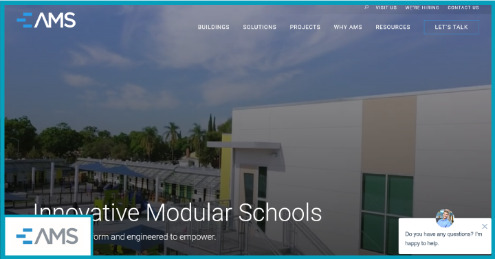
American Modular Systems (AMS) is a leading modular manufacturer in California, delivering high-quality learning spaces to schools. This construction website design reflects luxury with a minimalist approach that creates an optimal user experience. The typography on the website appears more professional and elegant, giving it a professional appearance that resonates with the logo.
Additionally, the site introduces different aspects of the business with a stunning portfolio and accessible menu that helps visitors to navigate to other pages easily. From the moment the visitor lands on the website, a creative combination of animations and video content creates an incredibly engaging experience.
3. FAQS
- What Are the Best Website Builders for Building the Best Construction Company Websites?
Some of the best website builders for building the best residential construction websites are – Rocketspark, Wix, Webflos, WordPress, and Mozello.
- How Do I Create a Construction Website With WordPress?
You can create a construction website with WordPress in simple steps –
- Choose a domain
- Purchase hosting
- Select theme
- Add required elements
- Write content
- Optimise it for search engines
4. Resources You Will Love
- 34 Marketing Automation For SaaS Tools To Grow Your Business Online
- 10 Powerful Strategies To Use Google Ads For SaaS Marketing
- Digital Marketing For SaaS – The Ultimate Guide To Grow Your Business Online
- 10 Ways To Make SaaS Marketing Plan Template Better Than Ever
5. About Growth Ganik
Growth Ganik is a rapidly evolving digital marketing agency in Sydney, Australia, specialising in SEO, content marketing, marketing strategy, and lead generation.
We work with clients from leading brands and industries such as B2B SaaS, nonprofits, and more to develop profitable digital marketing solutions that are data-driven to support all kinds of business goals – from widening user bases and gaining more traction for online engagement to increasing conversion and helping businesses scale up.
For creative tailor-made digital solutions and sustainable growth insights, get in touch with us!


