According to a recent report by HubSpot, “The number one reason why Generation X may choose not to donate to an organisation is because of an outdated website.”
This underscores the critical importance of having an exceptional nonprofit website that not only serves as a digital footprint but also helps enhance visibility and attract potential donors and sponsors.
Moreover, with a stellar website in place, nonprofits can connect with their audience, raise awareness about their cause, and amplify their impact. It also helps NGO’s in information dissemination, donation collection, and volunteer attraction.
To assist you in your journey, we have curated a refined list of the top 15 nonprofit websites of 2023 in Australia that can serve as a source of inspiration for your own. But before that, let’s explore the fundamental reasons why a nonprofit should have a website.
2. Importance of a Website for Nonprofits
A website not only provides a platform to share the organisation’s mission and impact but also serves as a hub for engaging with supporters, volunteers, and donors. Here are some key reasons why a website is crucial for nonprofits:
- Reach a Wider Audience
With a website, nonprofits can expand their reach beyond their local community and engage with a global audience. By optimising their website for search engines (SEO), nonprofits can increase their visibility and attract individuals who are passionate about their cause.
- Build Trust and Credibility
A professionally designed website instills trust and credibility in potential supporters. When visitors land on a well-maintained and informative website, they are more likely to view the organisation as reputable and reliable.
- Drive Donations and Fundraising
An effective nonprofit website can significantly impact fundraising efforts. By incorporating compelling storytelling, showcasing impact and providing a seamless donation process, nonprofits can inspire visitors to take action and contribute to their cause, enabling nonprofits to measure growth metrics.
3. Elements of an Exceptional Nonprofit Website
Let’s explore the key elements that make a nonprofit website exceptional. Incorporating these elements can elevate the visibility and effectiveness of your nonprofit’s website:
- Compelling Visual Design:
Visual design plays a significant role in capturing visitors’ attention and conveying the organisation’s brand. An exceptional nonprofit website incorporates visually appealing graphics, high-quality images and videos, and a consistent colour scheme that reflects the organisation’s mission and values. The design should be clean and modern, aesthetically pleasing, and accessible to all users.
- Clear and Concise Messaging:
A website should clearly communicate the nonprofit’s mission, goals, and impact. By using concise and compelling language that resonates with the target audience. Highlighting success stories, testimonials, and statistics can help to showcase the difference the organisation is making.
- User-Friendly Navigation:
It is important to make it easy for visitors to find the information they’re looking for. The website should have a logical site structure, intuitive menus, and clear calls-to-action. By implementing a search function, organisations can enhance navigation, allowing users to quickly find specific content.
- Responsive and Mobile-Friendly:
With the increasing use of mobile devices, it is essential to have a website that adapts seamlessly to different screen sizes. A responsive design ensures that the website looks and functions well on smartphones, tablets, and desktop computers. This enhances the user experience and encourages longer engagement.
- Donation and Volunteer Opportunities:
It is vital for nonprofits to make it effortless for donors or volunteers to find donation and volunteer options. Organisations can provide clear instructions on how to get involved, offer multiple payment choices, and ensure secure payment transactions. Let supporting your cause be as easy as a few clicks away.
4. Top 15 Nonprofit Websites Australia
From humanitarian aid to environmental conservation, these top 15 nonprofit websites not only drive their missions but also skilfully wield website design as a powerful tool for engagement and awareness. Explore how their website amplifies their causes and fosters a community committed to making a difference.
4.1 Red Cross Australia
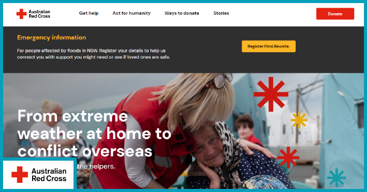
Red Cross Australia is a community service provider in Australia that is focused on improving the lives of people and reducing vulnerability. Looking at their nonprofit website Australia, you will find a user-friendly navigation bar with sections – Get Help, Get Involved, and Support Us.
The site uses a mobile-responsive theme and works well on devices of all screen sizes. The design and colour scheme are consistent across all the pages and blend well with the logo of the Red Cross. The home page banner showcases smiling communities and has many engaging elements such as – donate, register, find, and reunite, that encourage donors to give more.
It’s worth noting that the organisation’s mission is clearly laid out on the home page, introducing visitors to key areas like – international emergencies, charity gift cards, and getting prepared.
4.2 Habitat for Humanity
Habitat for Humanity is a nonprofit organisation in Australia that provides housing for those in need. The design of this nonprofit website Australia is simple, with monochromatic grids and images that present the information in an engaging and informative way.
The website is responsive on mobile devices and has more buttons at the bottom of the screen instead of infinite scrolling. In addition, the top bar has a search box and social media profiles, which show their active presence on platforms like – Facebook, LinkedIn, Twitter, and Instagram.
4.3 Charity: Water
Charity: Water is a well-established nonprofit organisation in America that works to bring water to people in developed countries. The best thing about the website is the excellent placement of images, donation forms, statistics, campaigns, and more.
The ‘About Us and ‘Our Work’ pages are well organised and make it easier for new visitors to learn more about their objectives and goals. For example, the Give Once / Monthly form overlaid at the top of the featured image instantly grabs the visitor’s attention. You will also find multiple buttons as you scroll down to the page with more CTAs. In addition, the site looks well-optimised for search engines and visitors, with a well-organised footer and header section.
4.4 Feeding America
Feeding America is a leading nonprofit organisation in America that aims to fight hunger. If we look at their website, it is very inspiring and conveys everything they do clearly. It is one of the best nonprofit websites Australia. The overall design of the website is neat and well-organised. For example, they used a sticky navigation bar that sticks to the top as you scroll down the screen.
Instead of bombarding visitors with text and images depicting the difficulties of those in need, the website showcases the organisation’s impact with success stories and partner associations. The home page is dedicated to news and case studies, while the navigation bar directs the visitors to their work, blog posts, and food banks.
The use of white space, social media posts, and graphic elements made the website stunning. Moreover, as an established organisation, they made it easier for their target audience to take action on various campaigns without much effort.
4.5 One Drop
One Drop is a nonprofit organisation that provides millions of people with sustainable access to safe water. Being among the best nonprofit websites Australia, they use a beautiful font and bold colours – which is the website’s highlight. At a glance, the website looks simple yet has powerful elements such as subscribing to a newsletter pop-up, awards & distinctions, press releases, fundraising activities, and more on the home page.
This charity website looks fantastic on a small screen (responsive design) without any disruption. The home page features a structured menu that directs the visitors to their areas of interest. In addition, the smooth transition effects and interactive elements make the website more appealing. Although there is a prominent donate button, it is aligned well with the research links and additional resources, which indicates the nonprofit cares about more than just funding.
4.6 Oxfam Australia
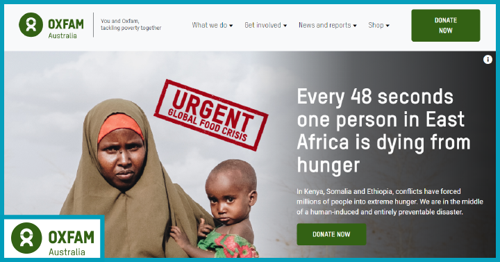
Oxfarm Australia is a well-known nonprofit organisation tackling poverty around the world. With very organised, structured, and well-researched content, the website has everything required to attract its target audience. In addition, adding success stories to the latest news, donate buttons, reports, and social media links makes nonprofit websites Australia more interactive and engaging.
The website is mobile responsive, and even the elements with rich content work perfectly on mobile. Whether it is the choice of images with human faces or a green-focused colour palette that blends well with the images – everything seems to work well to connect the organisation with its audience. The visitors will enjoy the dynamism of the website, which features photo galleries, success stories, news, and catchy CTAs.
4.7 Cancer Council Australia
Cancer Council Australia is a leading nonprofit organisation involved in the prevention and advocacy of cancer, its research, and patient support. The nonprofit website Australia is an excellent example of a nonprofit website. It provides visitors with detailed information on cancer, their work, how to get involved, and more.
The website is an excellent source of quality information about common cancers in the nation and how to prevent them. On the home page, one can browse through cancer information, get involved, find support and services, and contact health professionals.
The website highlights the excellent colour gradients – yellow, blue, and navy blue with maximum white spaces. In a few places, the information is presented in columns, making it easy for visitors to navigate seamlessly.
The SunSmart widget at the bottom of the home page makes the website more interactive and valuable for the visitor. Anyone who wishes to check the UV score can straightaway browse the website. Also, the footer section is beautifully organised with links to all essential pages like – shop online, types of cancer, cervical screening, and work with us.
4.8 Ford Foundation
Ford Foundation is a private nonprofit organisation with a vision to build a peaceful world. They have a simple nonprofit website Australia that is designed with user-friendly principles.
The home page features well-structured elements such as blog posts, news, stories, and join us. They follow the best practices like minimalist design, seamless navigation, catchy images, and engaging content to provide necessary information to the target groups and supporters.
Also, the site’s home page features an inspirational video that introduces visitors to their projects. Regardless of the best nonprofit website design, the site renders well on mobile devices. The whole website is full of CTAs that help those in need of assistance.
4.9 UNICEF Australia
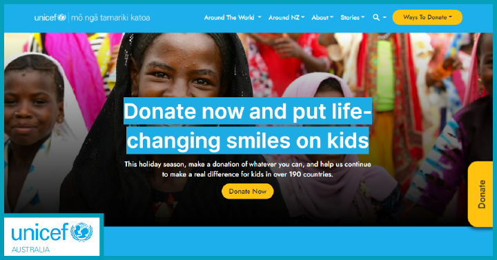
UNICEF is one of the leading nonprofit organisations in the world, with a presence in more than 190 countries. It aims to reach underprivileged adolescents and children. It is another excellent example of a nonprofit website Australia. With contrasting colours and attractive CTAs, the website explains its purpose clearly. In addition, the site highlights their track record, work, latest activities, stories, news, and more.
Their mission is clear throughout the nonprofit website design. The homepage highlights the organisation’s values and has many design elements, including dynamic media galleries, news, blog posts, and mouseover effects. Visitors to the website can also go through various projects they are involved with. No doubt, the website looks great on mobile devices, with content adjusted to fit small screen sizes.
The ‘ways to donate’ button on the top right of the navigation menu is the key highlight of the website.
4.10 Care Australia
Care Australia works around the globe to save lives, achieve social justice, and defeat poverty. The organisation designed the website to appeal to both its donors and supporters. With an easy-navigable menu, dynamic features, and attractive CTAs – CARE Australia does an excellent job of making every visitor an essential part of its mission.
Their primary focus is on supporting women and defeating poverty, which is reflected on every website page. Using bright CTAs, they centre opportunities for browsing the programs or becoming a member of the organisation.
This nonprofit website uses bold colours and a simple layout to create an expressive impression. Importantly, the website engages visitors by weaving success stories alongside the CTAs.
4.11 Fred Hallows Foundation
The Fred Hallows Foundation is a nonprofit in Sydney that aims to restore sight to millions of people worldwide. The organisation offers several ways to get involved in fundraising, volunteering, and donating. They promote their objectives with dark orange and white call-to-action buttons. In addition, there is plenty of information on eye health, research, sight simulator, and corporate partnerships.
The best thing we love about its website is that it invites curious visitors to engage with its content. The website is enriched with newsletter signups and social media icons that encourage visitors to connect with them on other platforms.
4.12 Good2Give
Good2Give is a Sydney-based nonprofit organisation committed to building a more giving society. This nonprofit website is branded to look consistent with the logo, using a white and orange colour scheme that looks professional and eye-catching. With an easy-to-use menu and clear buttons for “Our Credentials’ ‘Our Review’, Help Now, this website is designed to help its audience get the information and complete important tasks.
On top of providing a wealth of educational resources, the website offers motivational resources such as – case studies, publications, how-to guides, toolkits, and a charity directory to help visitors grow more expansive generosity in society. The website’s primary CTA is to help get more donors.
4.13 Plunket
Plunket is one of the largest providers of free support services for the development, health, and well-being of children under five. The website is a resource for learning about the child’s health and development. While there is no donation form on the home page, there are multiple sections and calls that lead to the donation page.
The website has clear branding with a navy blue, white, and orange colour scheme that brings to mind a colourful childhood. It also showcases pictures of children and offers quick-to-digest information on child development, child health concerns, and childcare.
The home page features recent news, success stories, and popular pages.
4.14 TLC for Kids
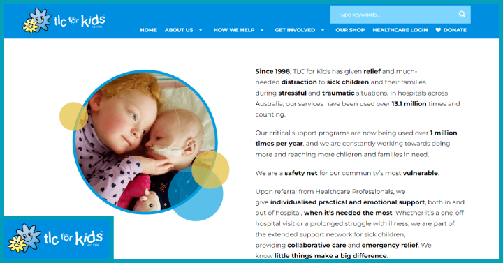
TLC for Kids is a children’s charity dedicated to giving emotional and practical support to sick kids and their families across Australia.
The very first thing a visitor meets when they land on the website is the aim that the organisation aims to accomplish. The website has plenty of white space to break the content into easily digestible formats. Also, the navigation is straightforward, encouraging visitors to learn more about their programs.
The main attraction of this nonprofit website is the excellent colour scheme and imagery. The site has a section that displays beautiful pictures of children and is visually appealing. Also, the site offers a library of videos and upcoming events. It also hosts an easy-to-use donation form.
4.15 Bush Heritage
Bush Heritage is a nonprofit organisation in Australia meant to conserve biodiversity in Australia. The Bust Heritage website offers multiple ways to get involved with the organisation. It uses captivating images to convey its mission and communicate about its programs and services.
On the home page, the visitors are engaged with the latest news, engaging blog content, information on species, and social media activities. This nonprofit incorporates beautiful imagery, texts, and white spaces to give it a clean look.
5. How Can a Digital Marketing Agency Help?
By leveraging the expertise of a digital marketing agency, a nonprofit can build a professional and effective website that attracts and engages their target audience, drives donations and volunteer sign-ups, and ultimately supports their mission. It allows the nonprofit to focus on their core activities while leaving the technical aspects of website development and marketing to the experts.
Growth Ganik is a full-stack marketing agency specialising in digital strategy and growth marketing. We adhere to a structured approach where we work closely with the nonprofit to understand their goals, target audience, and branding. This enables our web team to formulate a strategic plan that align the website with nonprofit’s mission and goals. Our team of experts designs and develops a visually appealing and user-friendly website that reflects your nonprofit’s brand identity. We ensure that the website is optimised for mobile devices and follows the best practices in terms of navigation, layout, and functionality to ensure a seamless user experience.
If you’re considering creating a website for your nonprofit, book a free consultation with us today.
6. FAQs
- Can a Non-Profit Get a Free Website?
You can build a nonprofit website for free on platforms such as – Wix, Weebly, WordPress, and GoDaddy. In addition, some hosting service providers charge a very nominal price to host your nonprofit website.
- Which Domain Is Best for Nonprofit?
The top domains for a nonprofit website are – .ngo, .org,.ong, and .com.
- Is Wix Free for Nonprofits?
You can create a professional website with necessary features, such as – signup forms, donations, unlimited hosting etc., on Wix for a lesser price. Wix also offers 50% discounts for nonprofits.
- How can I make my nonprofit website visually appealing?
To make your nonprofit website visually appealing, consider using high-quality images, videos, and graphics that align with your organisation’s mission and evoke emotions.
- What elements should I include on my nonprofit website’s homepage?
The homepage of your nonprofit website should be designed to make a strong impression and quickly convey your organisation’s mission and impact. Provide a clear and concise overview of your nonprofit’s mission, goals, and success stories. Incorporate prominent calls-to-action for visitors to donate, volunteer, or get involved. Display any awards, certifications, or testimonials that add credibility to your organisation.
- How can I improve the user experience on my nonprofit website?
To enhance the user experience on your nonprofit website, focus on creating a seamless and intuitive navigation system. Use logical site structure, intuitive menus, and clear calls-to-action to guide visitors to the information they’re seeking. Implement a search function to allow users to quickly find specific content. Optimise your website for mobile devices to ensure a smooth experience regardless of the device being used.

